For the NLNet Betula grant, I had to redesign the logo. The old one was not very recognisable at small sizes, barely looked like a birch, etc. June 2026, I spent several days working on the new one. Turned out, logo design and vector graphics are so much more complicated than I anticipated! Went through multiple approaches until I settled on the final logo. It's live on https://joinbetula.org or instances running newer versions, such as https://links.bouncepaw.com.
Approach 1. Generative birch trunk pattern
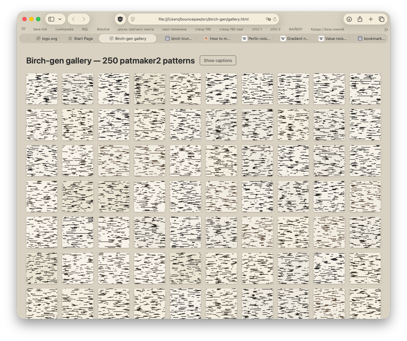
For some idea, I had this idea of giving every Betula instance a unique userpic/favicon, which is a randomised birch trunk pattern. Why not make the logo with the same pattern generator? Gotta make the generator first though. Spent some time implementing and ended up with a naïve generator. Here are some generations with different parameters:
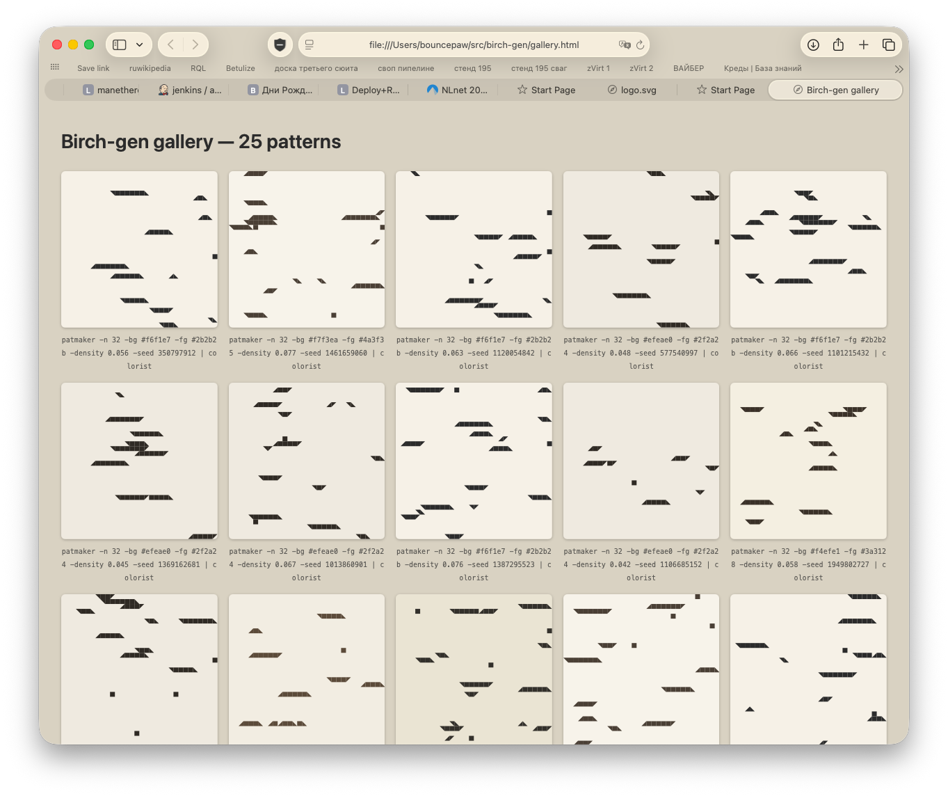
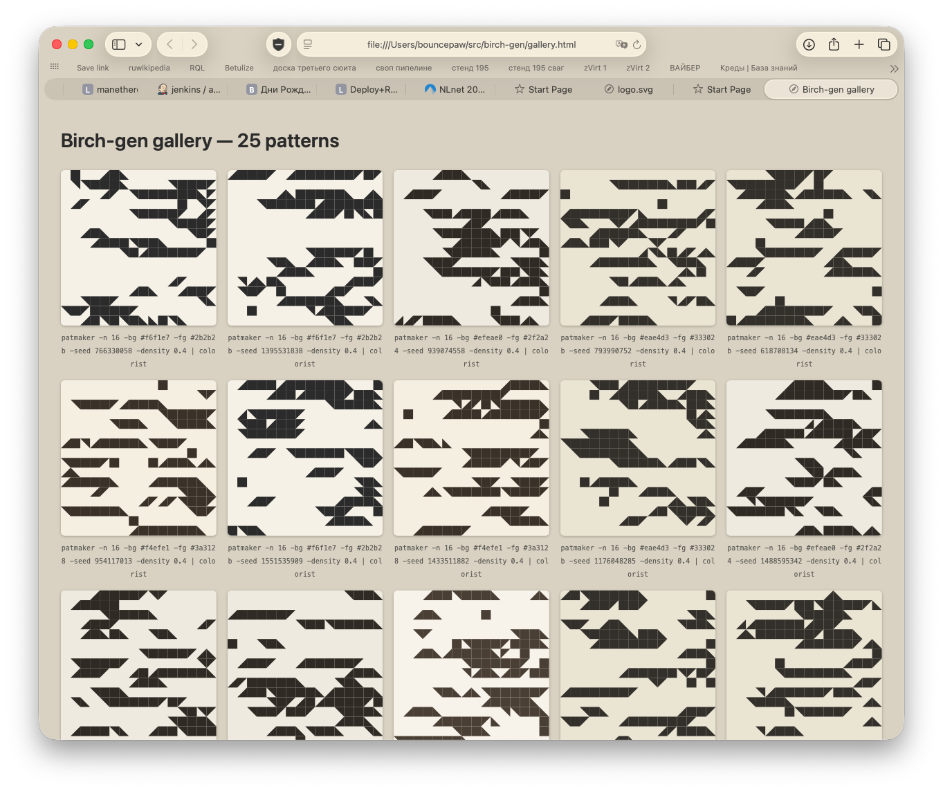
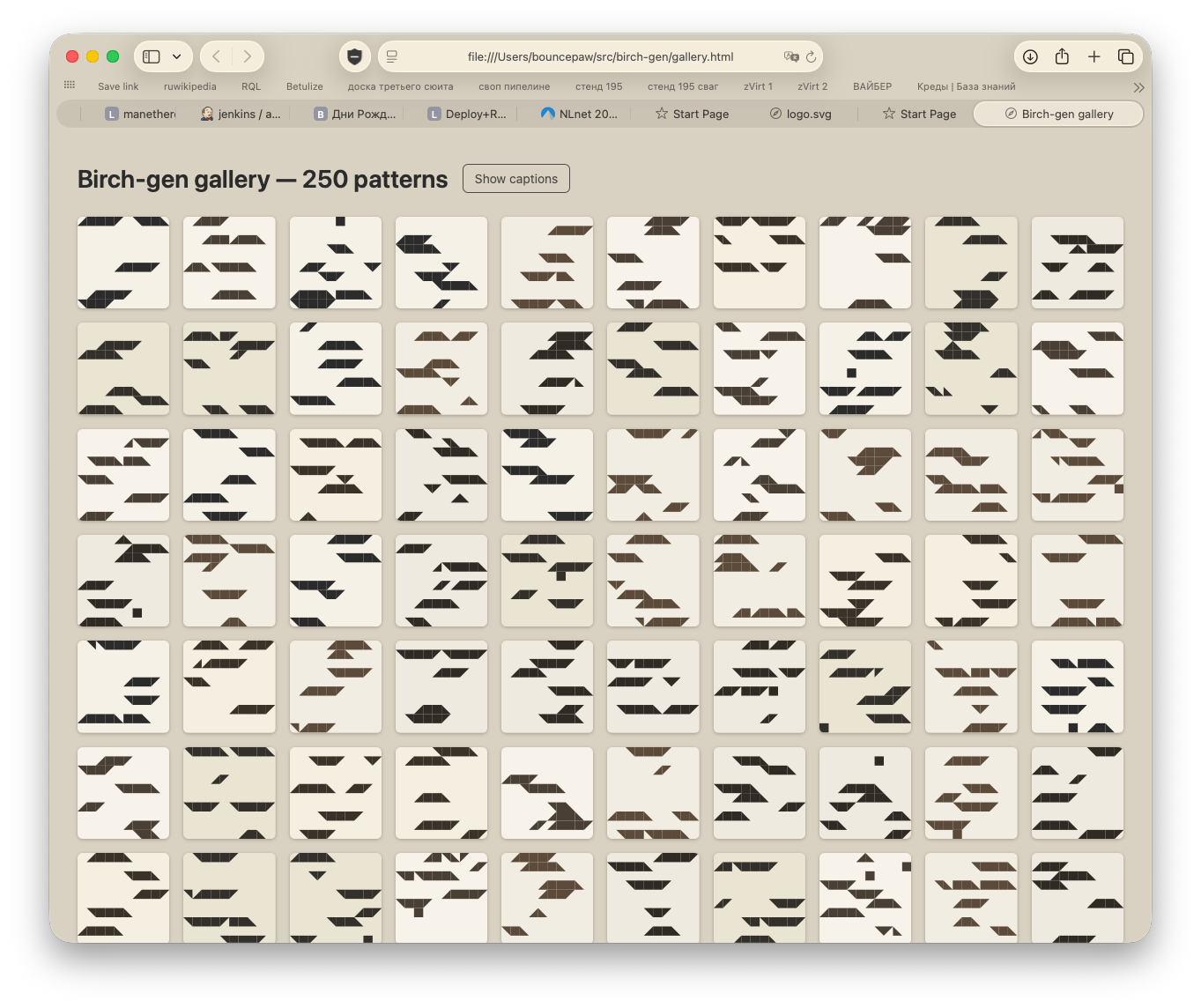
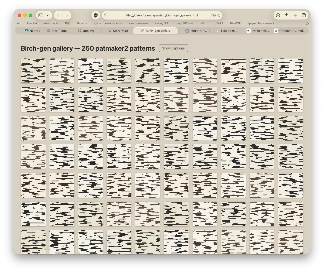
That's fun but does not really look like a birch would. What if I used Perlin noise for generation? Looks much more believable!
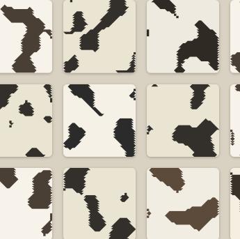
With some parameter combination, the generator could be used to make camo patterns.
This is a very good pattern generator, but it must not be a logo. Devastated from such a big waste of time, went looking for new ideas. Maybe I'll revisit this generator in the future though, but definitely not for the logo.
Approach 2. Branches
What if I bent a birch thunk? Found a piece of paper, drew lenticels and played around:
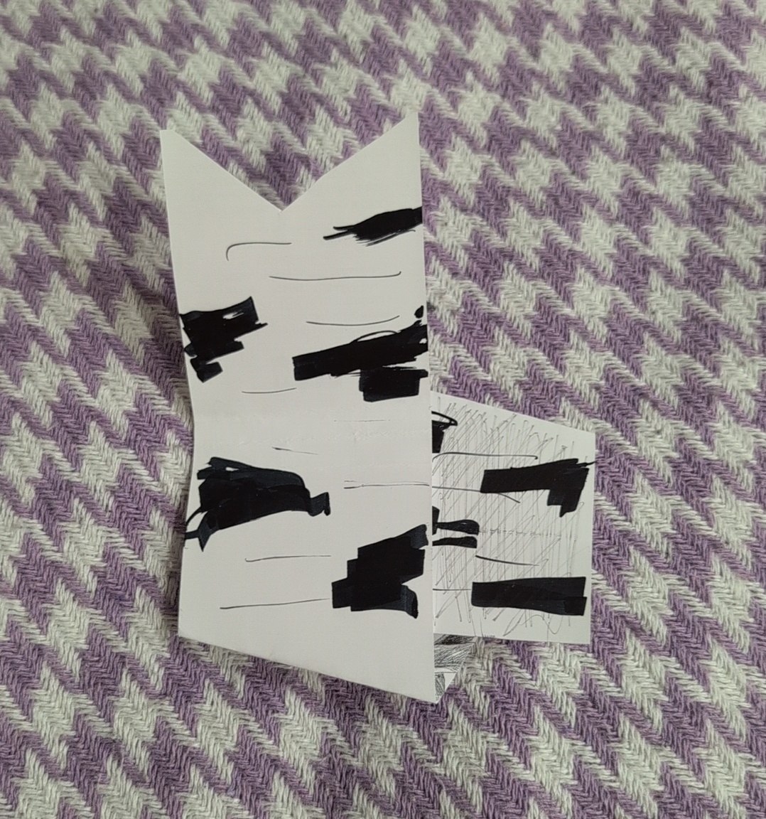
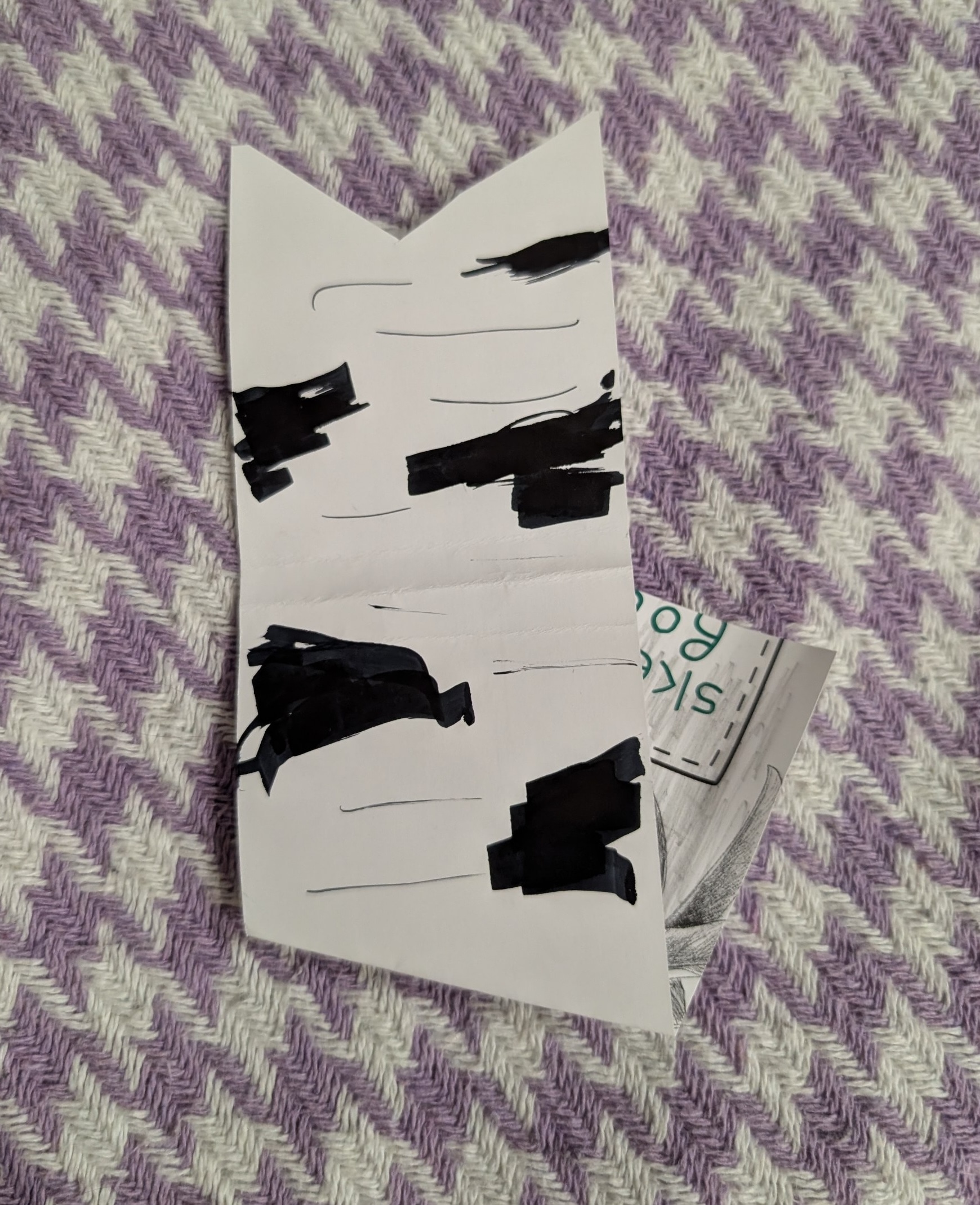
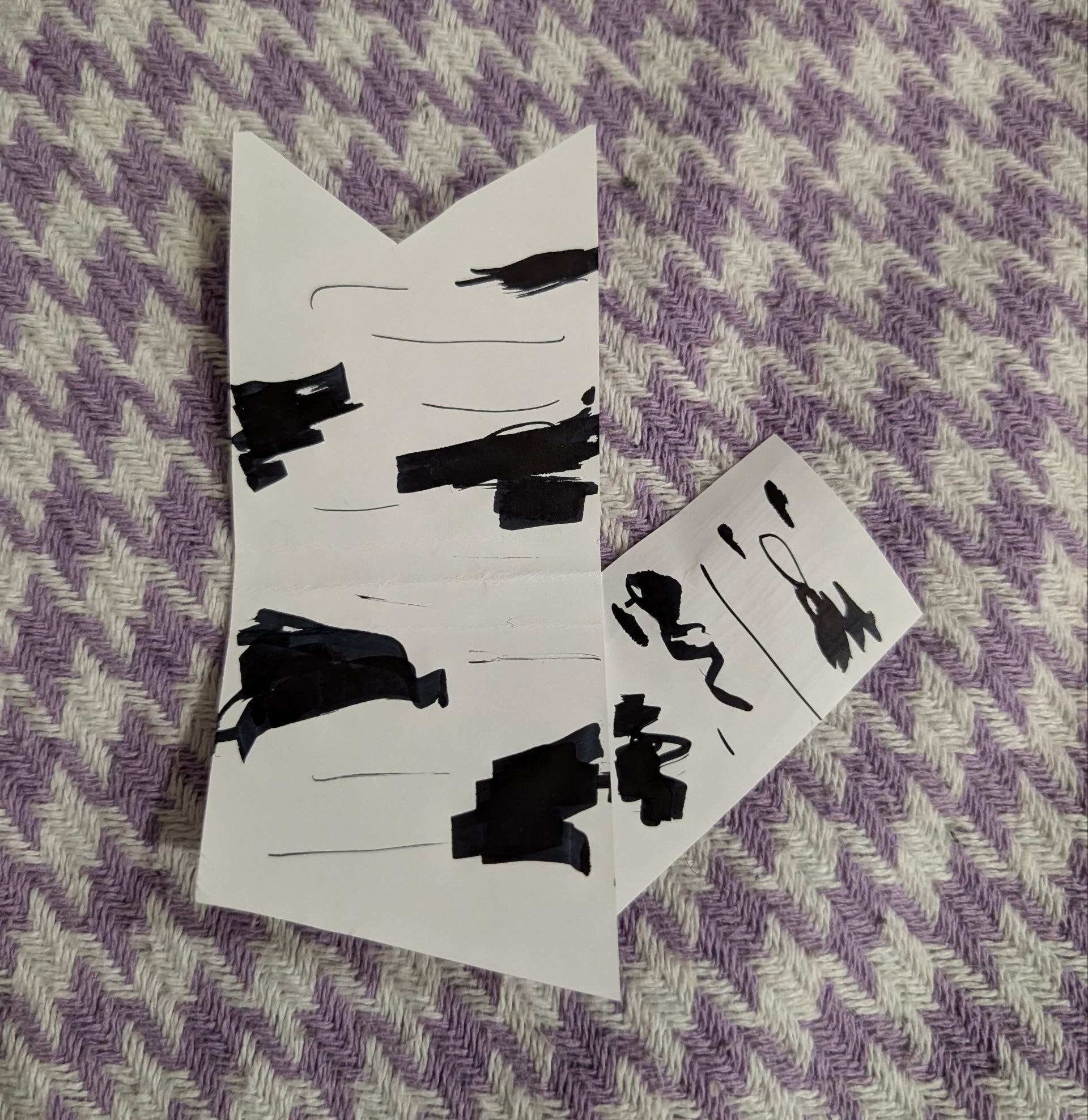
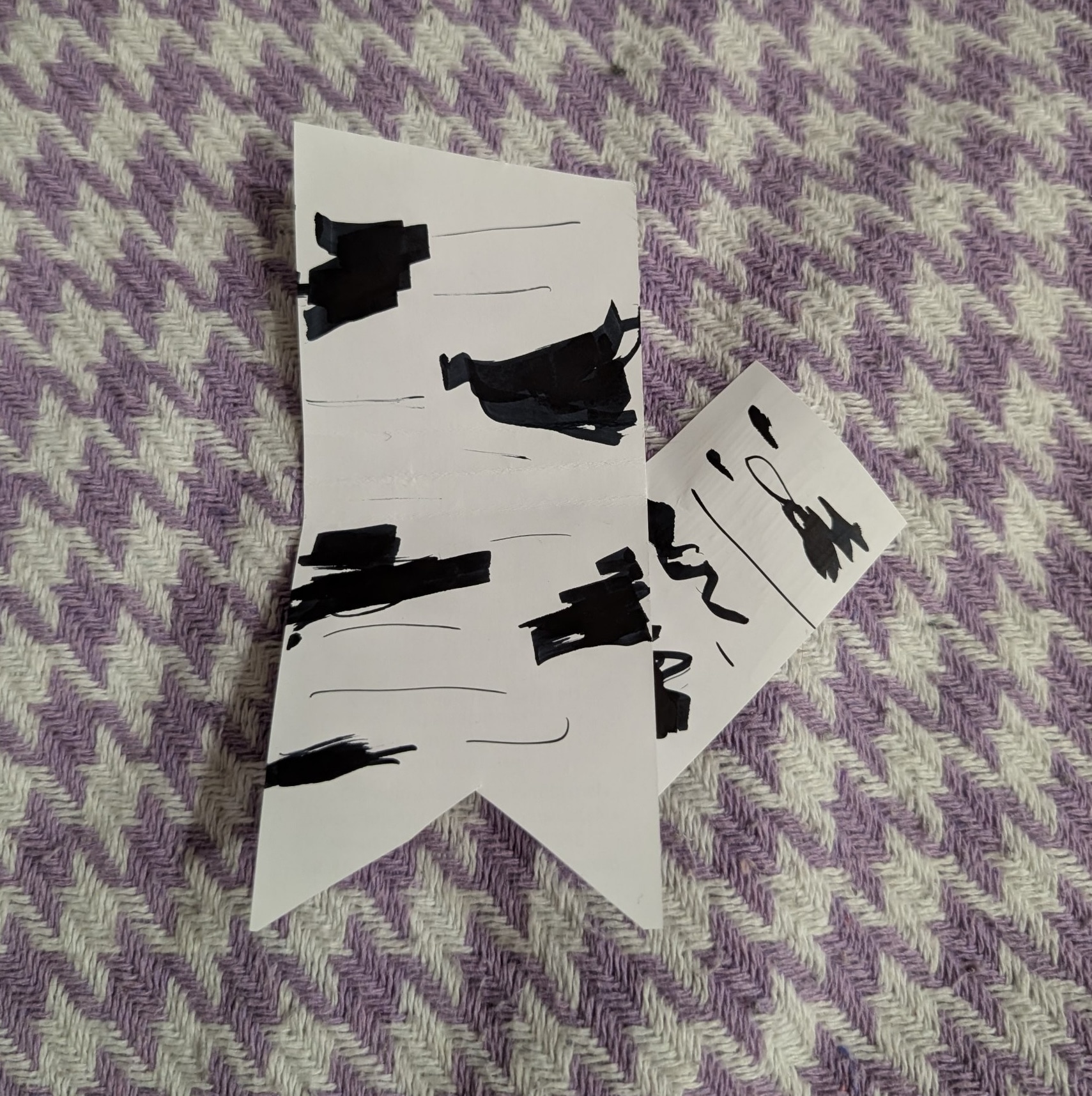
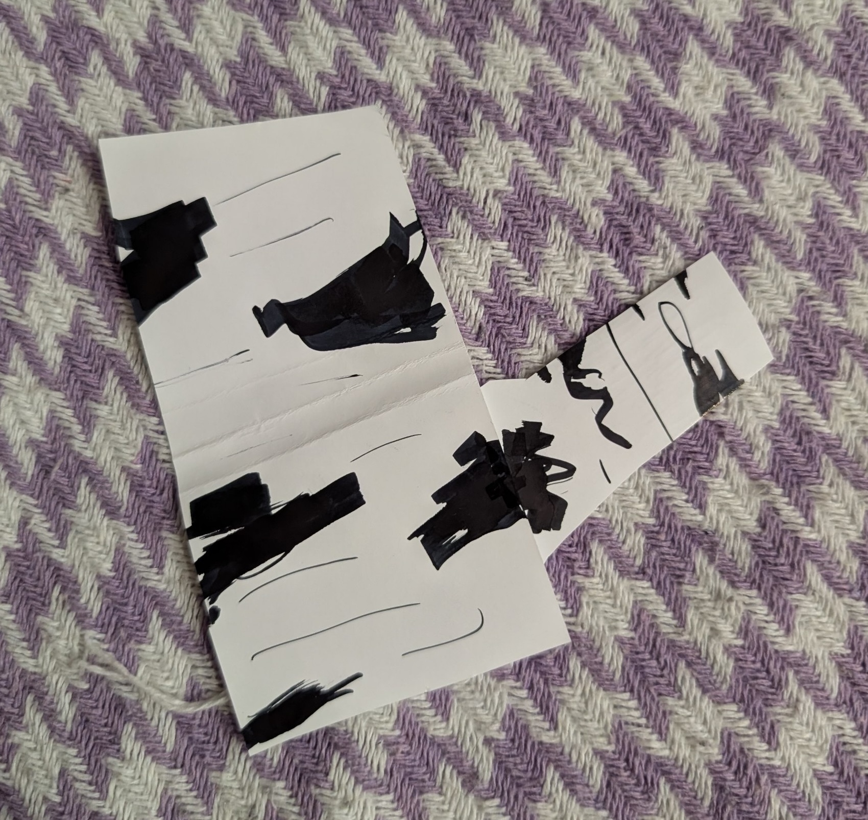
This branch layout is the best!
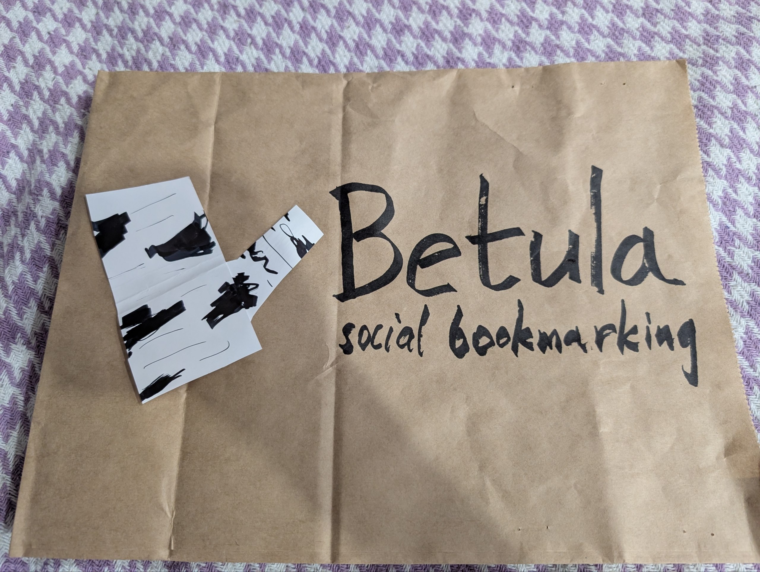
With text. Drew this on a paper bag.
Next day went onto digitalising the idea. Instead of drawing the birch anew, took a birch photo and edited it.
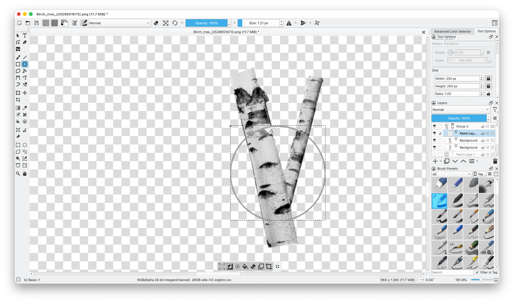
Process...
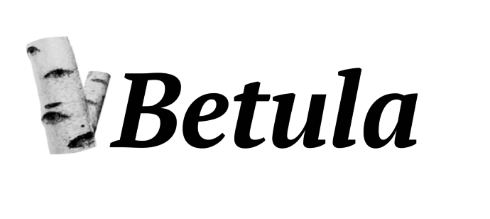
PT Serif composition.
OK that won't do.
Approach 3. Vector stump

The old logo was an SVG vector art which I made in text editor. Yes, I made all those Bezier curves by hand. What if I made an SVG again, but in Inkscape this time? This is a quick messy sketch. Hmm that kinda works!
I love the concept of the lenticels looking like eyes. One of the reasons Betula pendula is my favourite tree.
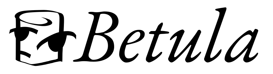
In the old logo, I used a Garamond font. Not sure which one. This time I took OFL-licensed EB Garamond. Hey it's pretty good!
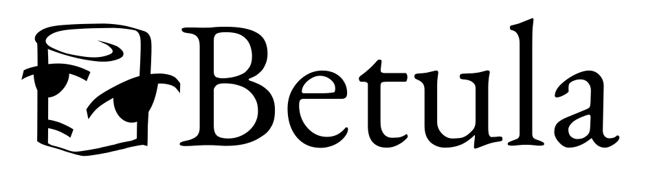
I really love the quirk of the italic EB Garamond, but the regular one seems to work better. Went with it.
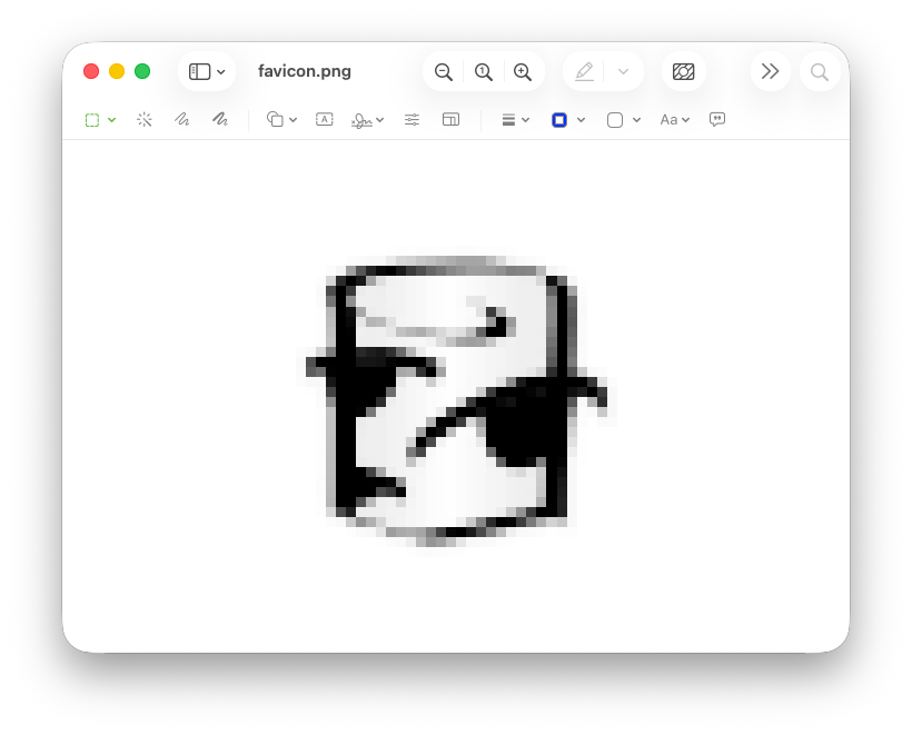
The logo would go to the favicon for sure. Rendered it at 32 by 32 pixel. Too blurry.
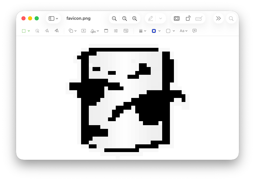
With no anti-aliasing it's bad.
Spent some time optimizing the image so it looks better at low-res. Unlike raster images, where more points means a smoother images, in vector images it's better to have less points. Peculiar.
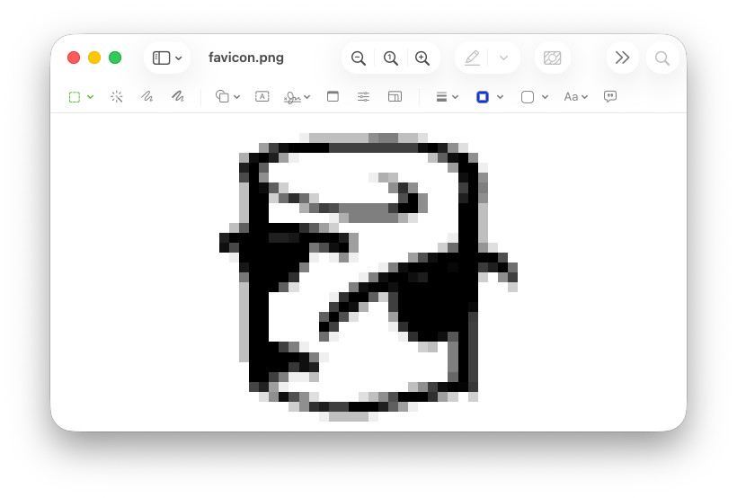
A preliminary favicon.
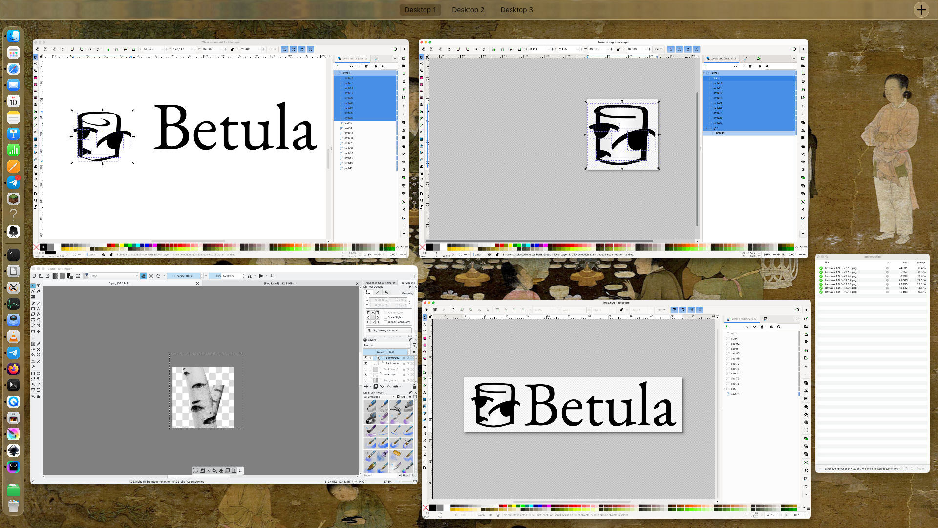
So many windows...
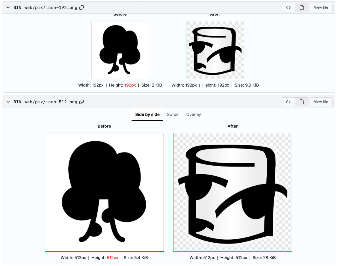
Comparison with the old logo. At some point I dropped the whirl at the top.

And favicon comparison.
Polishing
After seeing the logo in use for a couple of days, I thought it should be improved further. I did think of optimising for low-res favicon rendering, but I thought of 32 by 32 pixel images, which Retina displays use. I don't have a Retina screen, and I end up with regular 16 by 16 pixel favicons, and the image is not crisp enough to my taste. And overall some proportions could be improved.
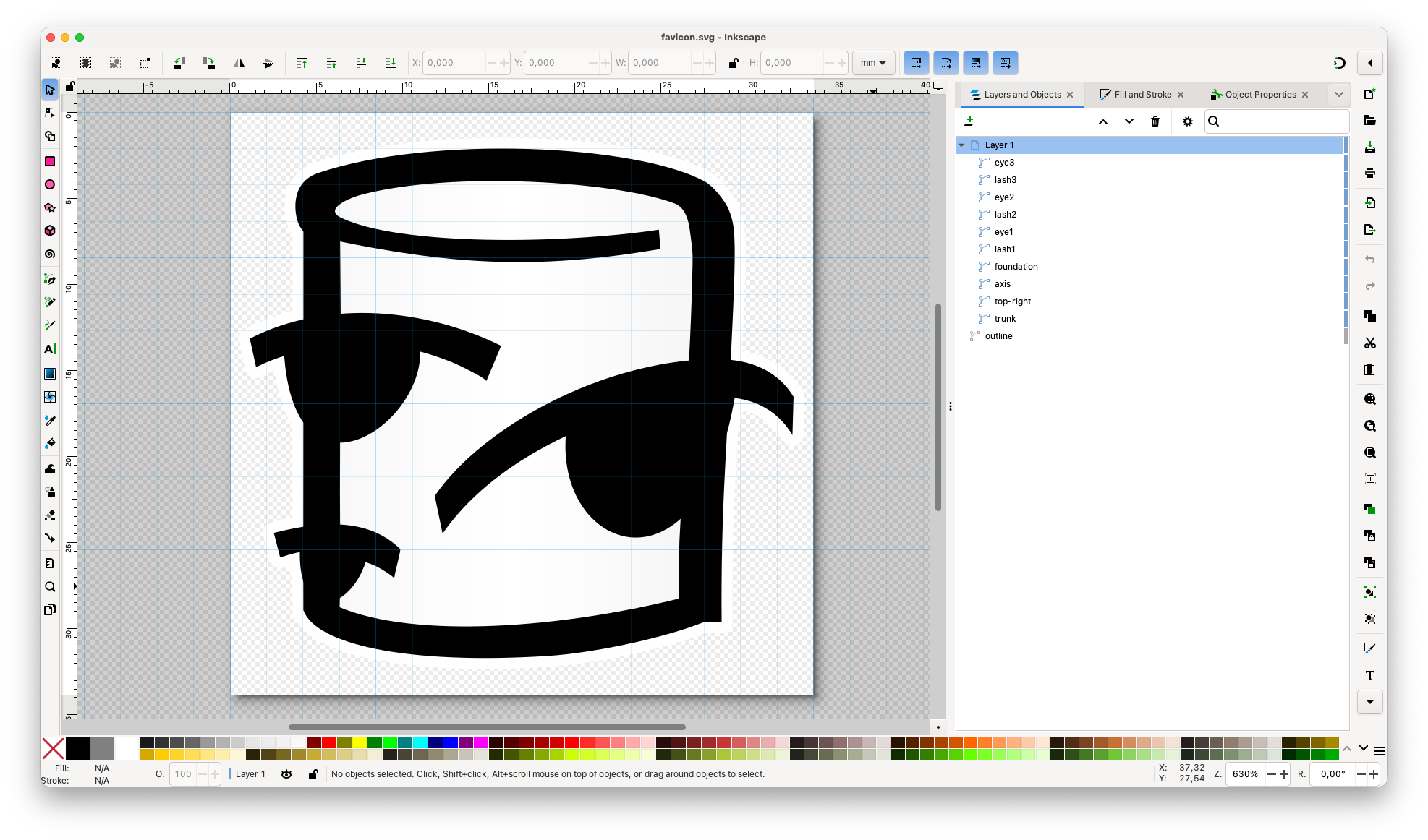
Working in Inkscape. Put on a 16 by 16 squares overlay to get a better idea what lines become what pixels. Made the gray-white-gray gradient less noticeable (it's still there though).
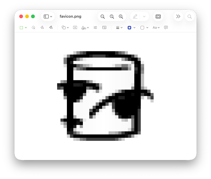
Got this solid favicon.
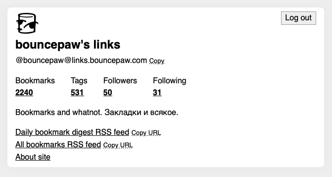
The stump can be found on profile. It is also federated as userpic.
Full logo with text is found on the About page.
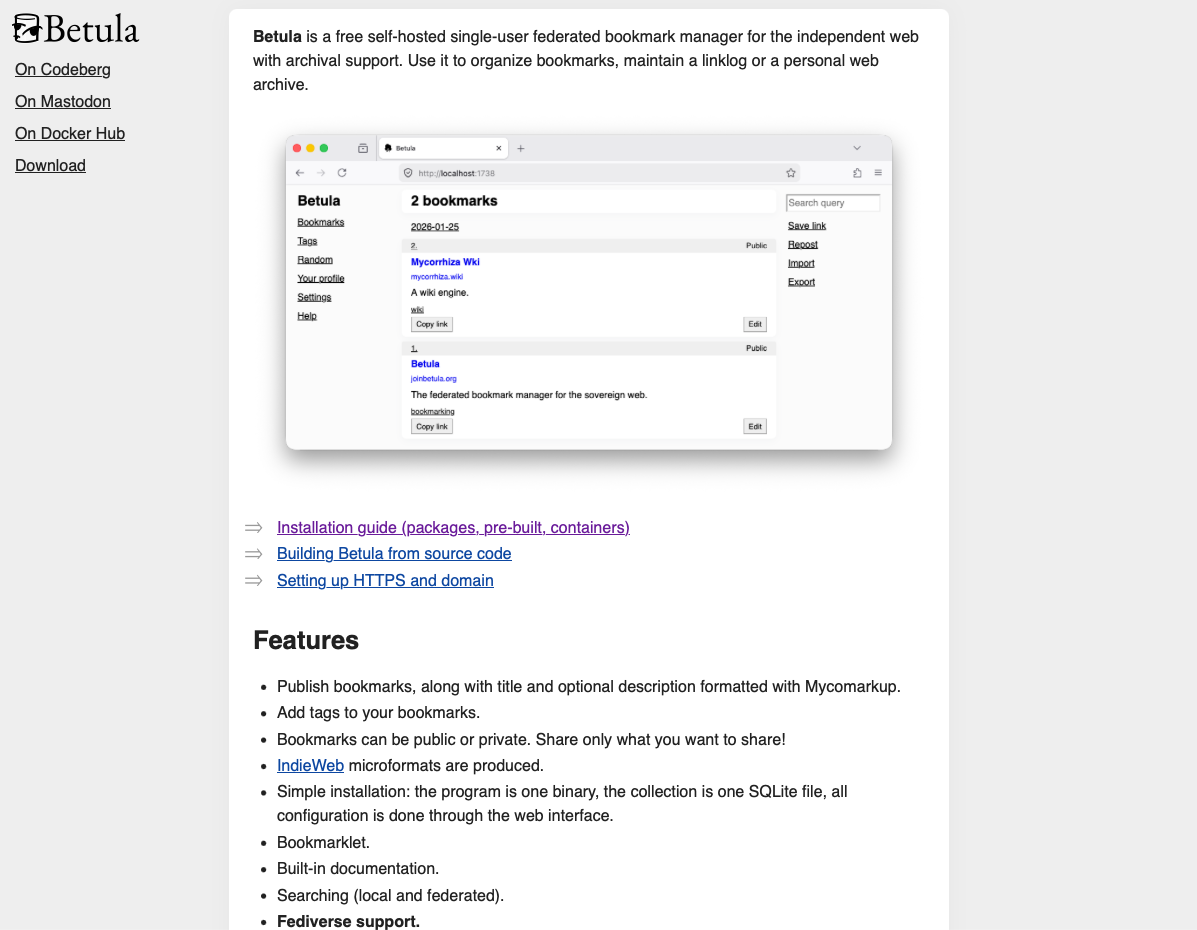
And on the website! I also redesigned it so it looks something like a Betula.
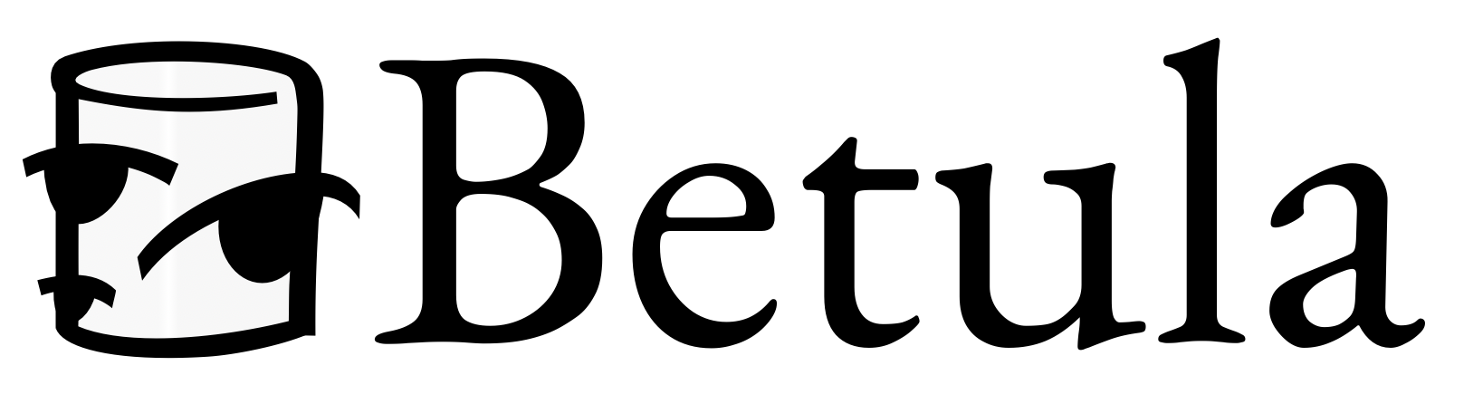
This is the final result. I'm content.